Tuesday, 7 December 2010
Location
We may have a problem with filming dates and location, so we're going to put the filming forward slightly and the location will have to be looked into.
Poster 2nd draft
We are nearer to completing the poster for the film, but we need an image which won't be taken until the day of filming. We organized the layout, font and colour to make it look as professional and exciting as we could. We also included the names of the cast, director, editor and everyone involved. Also the poster has the logo's of real production names: Working Title, Studio Canal and Universal, also our own for a new production name: Blue Box which I made the logo for. Justin designed the poster with input from the group as a whole to produce a poster that is near identical to a real one. We studied posters such as Sherlock Holmes to gather ideas and see how it should be set out.
Tuesday, 30 November 2010
Production company name
We decided to combine both of our production names from last year: Big Box and Blue Monkey, so we came up with Blue Box Productions as our new one. Today I quickly designed and made a production logo using Adobe Illustrator which is temporary, this will go on our poster and possibly at the beginning of the film.
Thursday, 25 November 2010
Tuesday, 16 November 2010
Attracting The Audience
We sent an e-mail to the sixth form asking for actors/actresses so this has made people aware of the film too. Also Ryan created a Facebook page for the film so people can comment and send messages asking about it.
Poster Draft

This is our poster draft created by Justin. The qoute at the top: You're in good hands with a zombie, is an idea we found from using a slogan generator online and the image in the centre is yet to be done, we're going to get a photo of the cast. Samuel White's name is visible because he is the main actor, also the title in bold writing so it's very visible. It also includes the names of the directors and production names, also in the bottom right hand corner it has the date of when the film is to be released in the cinema.
Progress
Today we went to town and bought a cheap wooden table from the charity shop. We will be using this for the scene where Mickey throws it out the window/door because he can't be bothered to tidy up. We also have fake cigarettes for one scene and we still need to get the correct clothes sorted for each character, also we need to still get some other props: beer and magazine, which we will get on the day of filming and fake blood and fake hand which we will try and find before we film or make ourselves.
Tuesday, 9 November 2010
Cast
We now have a full cast for the film:
Luke - Samuel White
Mickey - Samuel Peckham
Dave - Edward Watson
Caroline - Steph Dearden
Justin - Driver
We have also printed off a copy of the script for each actor/actress so they can learn their lines and understand what they have to do before we begin filming. I highlighted the lines for each character so it's clear for the parts they're involved in. We may need a teacher to play the boss in one of our scenes.
I wrote the script, the directing will be a joint effort between the three of us, more so Justin and the editing will be mostly Ryan.
Thursday, 4 November 2010
Props
Below is a list of props that I have decided we are going to need:
1. Car
2. Mobile phone
3. Games controller
4. Beers
5. Table
6. Magazine
7. Fake hand
8. Guitar
9. Fake blood
10. Cutlery
11. Clothing
Below is a list of settings that we will also need for different scenes:
1. House - lounge, kitchen, bathroom, front garden
2. Office
3. Road for collision
1. Car
2. Mobile phone
3. Games controller
4. Beers
5. Table
6. Magazine
7. Fake hand
8. Guitar
9. Fake blood
10. Cutlery
11. Clothing
Below is a list of settings that we will also need for different scenes:
1. House - lounge, kitchen, bathroom, front garden
2. Office
3. Road for collision
Tuesday, 2 November 2010
Progress
We have a completed script and four out of the five actors that we need for the film, the last person we need is to play the main character, we have sent an e-mail asking for anyone to play this part and we hope to have this sorted by the end of this week.

We also have the story board in process which had to be re-made because it was too basic with lack of detail on the shots. The next step will be to put the story board into an animatic with colour which will be effective.

We also have the story board in process which had to be re-made because it was too basic with lack of detail on the shots. The next step will be to put the story board into an animatic with colour which will be effective.
Production Company
We came up with the idea of making a production company name for the opening of our film. Last year Ryan was in a group that produced the production name: Blue Monkey and me and Justin made the production name: Big Box. So, we are thinking of forming a new production name by putting the two names together for this film. Another idea could be to merge the names, for example: Blue Box or Big Monkey.
I have recently been thinking about the production name and the opening so I thought about mixing both production companies together. Last year for mine and Justin's film: Silent Revenge, the opening for Big Box Productions was a close-up of a big box falling down on top of a gerbil. In Ryan's film: Hidden Crime, the opening for Blue Monkey Productions was the title sliding in with an image of a blue monkey. I had the idea of putting these together: a blue monkey being crushed by a big box and then the name scrolls in: Big Box & Blue Monkey Productions.
I have recently been thinking about the production name and the opening so I thought about mixing both production companies together. Last year for mine and Justin's film: Silent Revenge, the opening for Big Box Productions was a close-up of a big box falling down on top of a gerbil. In Ryan's film: Hidden Crime, the opening for Blue Monkey Productions was the title sliding in with an image of a blue monkey. I had the idea of putting these together: a blue monkey being crushed by a big box and then the name scrolls in: Big Box & Blue Monkey Productions.
Thursday, 21 October 2010
Magazine Review Draft
We studied the magazine 'Empire' which is good for film reviews, so we took ideas from this such as fonts, images, layout, headings etc... so we could build our own review for our film. Justin began this by forming a layout and started adding headings and text using different fonts, sizes and colours to make it more interesting for the reader. Below is our film review draft so when we want to make the actual review we can use this as a starting point. Also is a film review of 'Kickass' from Empire magazine which we took ideas from to develop ours. As it is obvious our template is similar to that of the 'Kickass' one, this is because we took the layout idea to create our own, making it look more realistic.


Thursday, 14 October 2010
Story Board
This is our story board that me and Justin made showing the scenes/shots that we will be filming. Also it explains what is happening with the characters and it follows the movie through explaining the story in still images.
Tuesday, 12 October 2010
Mood Board
This is our mood board which Ryan made using images from the internet which represents the mood and theme of our film.
Script
Dead mans love final
View more documents from RyanA2media.
This is the script which was written by me and Ryan had involvement in a couple of scenes.. It includes every scene that we wish to do and also the characters dialogue. It took us about a week to plan out and finally write before we went through it and edited parts which took another couple of days. When in the process of filming we will try to keep to the script as much as we can and if we have enough time then we may add anther scene which we have ideas for.
The idea of this scene is to have Luke and his wife in bed with Dave listening outside, he walks in on them and they tell him to leave. Then Mickey appears from either under the bed or in the closet holding a video camera and then tells Luke to leave as well. This would be a very funny scene to have and we are all happy for it to be added if there is enough time left.
The script is quite detailed with including all the scenes, having the characters expressions and actions, also the dialogue. This will help us a lot when we work on the filming/editing because we can follow it carefully and create exactly what we have written down, knowing how everything must look and what to do, knowing our next step by looking back at the script.
Monday, 11 October 2010
Influences and Posters


Our film is a romantic horror comedy so the two main films that have given us inspiration because they are very similar are Shaun Of The Dead and Scary Movie. The characters and comedy we are going to be using relates to how they are used in these films which is why they link. The biggest similarity between our film and these are the way the characters are represented. In Shaun of the Dead, the character Ed is seen as a lazy, but funny person which is the same as our character Mickey. The humour in Scary Movie is quite different though because it could be seen as quite "cheap" and "silly" but it's good inspiration because the genre is the same. Zombieland is similar to Shaun of the dead as it is about zombies and it also includes comedy, so this is another film that we can relate to ours and is an influence.
I think that the Shaun of the Dead poster is really effective because it shows all aspects of the film. The horror/zombie side to it is shown with all the zombies and blood, the comedy part is shown with a plain looking man with a cricket bat, also the romance is shown as he is holding a bunch of flowers. It also says: a romantic comedy, with zombies. The Scary Movie poster is very simple and explainable as it shows parts from the movies it is mocking with the man wearing the Scream mask and the man holding a shirt saying: 'I see dead people' which is from Sixth Sense. It looks comical with the killer sat in a cinema seat holding a bucket of popcorn and their facial expressions looking quite sarcastically scared, showing it isn't serious. The Zombieland poster shows them standing in a grave yard all carrying weapons, it doesn't really show the comedy side to it but it still a good poster to show what type of film it is and what it is all about.
Our target audience is aiming to be 15+ (adult) because of the comedy which younger people probably wouldn't understand and the fact it includes scenes of violence, bad language and sex wouldn't be appropriate for people below that age. Shaun of the Dead and Zombieland are both 15's and Scary Movie is an 18.
Two other film we have recently been looking at which I suggested were Me, Myself and Irene and Superbad. The idea is to have the split face with half being Luke when he's normal and the other half being when he turns into a zombie. The idea of Superbad is with the smaller characters in the background such as Mickey, Dave and the wife. So we are thinking of putting these two together with the split face in the centre and the other characters in the background.
Setting

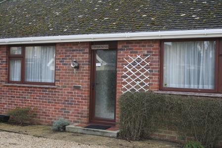

Above are three photo's taken of certain scenes we willbe filming for our film all based in one setting. The setting is someone's house to use for the scenes where our characters Luke, his wife, Mickey and Dave will be mainly used.
The top photo is the bedroom. This will be used for our character Luke and his wife in bed on a couple of scenes. There is also a possibility of using it for another scene idea that we have, but it's not added to the script because we will only use this is we have enough time left.
The second photo is the outside of the house which will be used on a couple of occasions. When Luke is entering the house after he has been hit by the car, also when he returns from work. But the main shot for this scene will be when he leaves the house in the morning and then Mickey throws a table through the window.
The bottom photo is of a room which we might use for two possible ideas: when Luke is eating his wife and also we could turn it into an office to use for the work scene.
A2 Proposal
For this years coursework we have decided to make a short film. The genre of our film is a Zom Rom Com (zombie romantic comedy). Films that relate to this are 'Shaun of the Dead' and 'Zombie Land'. The idea of the film is to show a man whom turns into a zombie but tries to continue and live a normal life with his wife/girlfriend. It will show him doing normal human things that happen everyday but him trying to deal with it whilst being a zombie. We will develop this idea more so it is much clearer of what the film is all about.
Short film analysis
The short film that I analysed was from the BBC film network, it's called 'Shelf Life'.
http://www.bbc.co.uk/filmnetwork/films/p004thbd
1. What genre is it and how is this made apparent through the Key Concepts?
Shelf Life is a comedy and the concept of it is quite simple. A man is putting up a shelf and when he drills through the wall he accidently kills someone.
2. How does the narrative work?
The film builds up slowly with a man walking in a room and setting up equipment to put up a shelf on his wall. It's very simple and nothing really happens until suddenly you see him drilling a hole in the wall and then on the other side is a man whom suddenly dies in his chair. As the man moves his head the hole behind him in the wall is directly where his head was and blood is running from it. So basically the man setting up the shelf killed the old man on the other side by accident. The funniest part of this is that he is holding two awards which say: ASAP (Association of Accident Prevention) for outstanding safety. This then leads to the man drilling through a mans head which is the joke.
3. Write something about the technical aspects of the film (camera angles, framing, composition, editing, mise-en-scene, music and sound effects) etc?
The camera angles are pretty basic at the beginning because it focuses all on one shot with the man entering the room, going back out and re-enterting a few times. There is a close-up shot of when he holds the two safety awards so it's clear for the viewer to read and understand the comedy when afterwards he drills through the mans head. The continuity of the film is very good and the editing wouldn't have been too awkward in most areas because they're still shots which last a long time. The music that is used enters a few times every time the man leaves the room and re-enters as credits appear such as: Directed by Charles Hendley. This sounds eery like a thriller which builds suspense leading to the comical part in the film which then reveals it's not a thriller.

This is the close-up shot of when the innocent man is killed when the drill goes through his head. This is quite gory with the blood trickling down his mouth but the expression on his face andthe whole situation makes the audience laugh and shows it's a comedy.
4. In what ways does the media product use, develop or challenge forms and conventions of it's genre?
The film is quite unrealistic with the drilling part so it challenges the audiences belief in this. But this probably doesn't really matter too much because it's a comedy anyway and anything can happen in a comedy. It develops throughout the film by starting with eery music and slow pace action when it finally appears to be a comedy at the end which changes the audiences opinion. I think that it challenges the use of comedy because the way it begins as being a thriller is very clever when suddenly it turns into a comedy which is risky because the audience could quickly change their opinion on the film.
5. What do you like about the text?
I liked the film because I think it was quite clever as it began looking like a thriller with the suspense music and the slow pace. It then turned into a comedy all of a sudden which changes the mood of the audience. I didn't really like it when the credits appeared because it continues with holes being drilled through the wall for ages.

This is the title scene, I like the font because it looks as if it's a thriller or horror when the audience don't know what to expect.
There is no music in Shelf Life. When the titles appear at the beginning there is a sound that comes and goes, but apart from that there isn't anything else. At the end the only sound is of the drill going through the wall with the radio still playing as the credits appear.
http://www.bbc.co.uk/filmnetwork/films/p004thbd
1. What genre is it and how is this made apparent through the Key Concepts?
Shelf Life is a comedy and the concept of it is quite simple. A man is putting up a shelf and when he drills through the wall he accidently kills someone.
2. How does the narrative work?
The film builds up slowly with a man walking in a room and setting up equipment to put up a shelf on his wall. It's very simple and nothing really happens until suddenly you see him drilling a hole in the wall and then on the other side is a man whom suddenly dies in his chair. As the man moves his head the hole behind him in the wall is directly where his head was and blood is running from it. So basically the man setting up the shelf killed the old man on the other side by accident. The funniest part of this is that he is holding two awards which say: ASAP (Association of Accident Prevention) for outstanding safety. This then leads to the man drilling through a mans head which is the joke.
3. Write something about the technical aspects of the film (camera angles, framing, composition, editing, mise-en-scene, music and sound effects) etc?
The camera angles are pretty basic at the beginning because it focuses all on one shot with the man entering the room, going back out and re-enterting a few times. There is a close-up shot of when he holds the two safety awards so it's clear for the viewer to read and understand the comedy when afterwards he drills through the mans head. The continuity of the film is very good and the editing wouldn't have been too awkward in most areas because they're still shots which last a long time. The music that is used enters a few times every time the man leaves the room and re-enters as credits appear such as: Directed by Charles Hendley. This sounds eery like a thriller which builds suspense leading to the comical part in the film which then reveals it's not a thriller.
This is the close-up shot of when the innocent man is killed when the drill goes through his head. This is quite gory with the blood trickling down his mouth but the expression on his face andthe whole situation makes the audience laugh and shows it's a comedy.
4. In what ways does the media product use, develop or challenge forms and conventions of it's genre?
The film is quite unrealistic with the drilling part so it challenges the audiences belief in this. But this probably doesn't really matter too much because it's a comedy anyway and anything can happen in a comedy. It develops throughout the film by starting with eery music and slow pace action when it finally appears to be a comedy at the end which changes the audiences opinion. I think that it challenges the use of comedy because the way it begins as being a thriller is very clever when suddenly it turns into a comedy which is risky because the audience could quickly change their opinion on the film.
5. What do you like about the text?
I liked the film because I think it was quite clever as it began looking like a thriller with the suspense music and the slow pace. It then turned into a comedy all of a sudden which changes the mood of the audience. I didn't really like it when the credits appeared because it continues with holes being drilled through the wall for ages.

This is the title scene, I like the font because it looks as if it's a thriller or horror when the audience don't know what to expect.
There is no music in Shelf Life. When the titles appear at the beginning there is a sound that comes and goes, but apart from that there isn't anything else. At the end the only sound is of the drill going through the wall with the radio still playing as the credits appear.
Beginning of A2
This year I have decided to work in a group of three: me, Justin and Ryan. This will make it easier to film and give us more choices compared to last year when me and Justin worked alone. We have decided as a group to make a short film for our coursework because this is what we would enjoy the most and also what we have most ideas for. Also last year all three of us got very good grades so we hope that this year we can make another good film and get another good grade.
Subscribe to:
Posts (Atom)